Context
A world expo with a mission
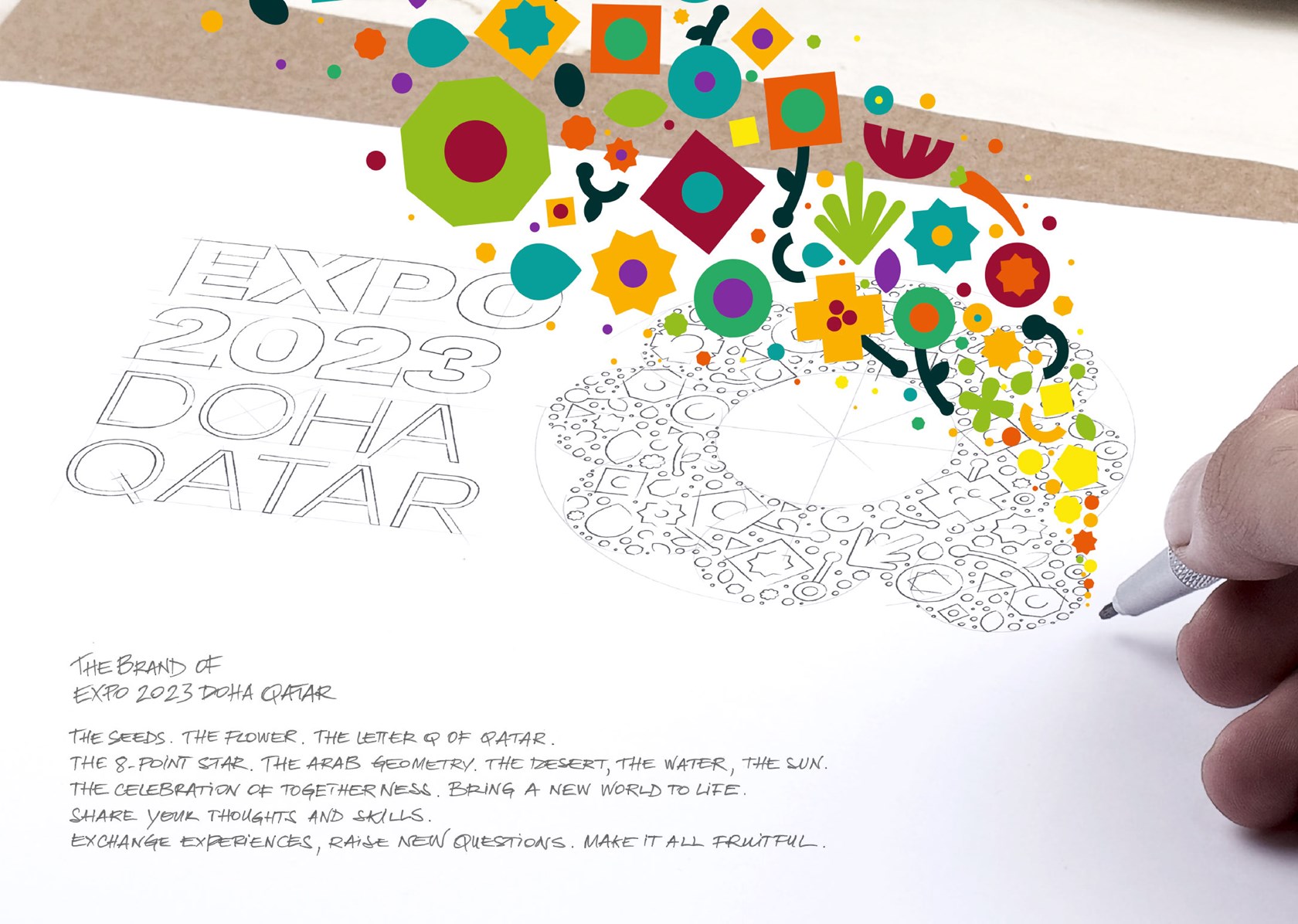
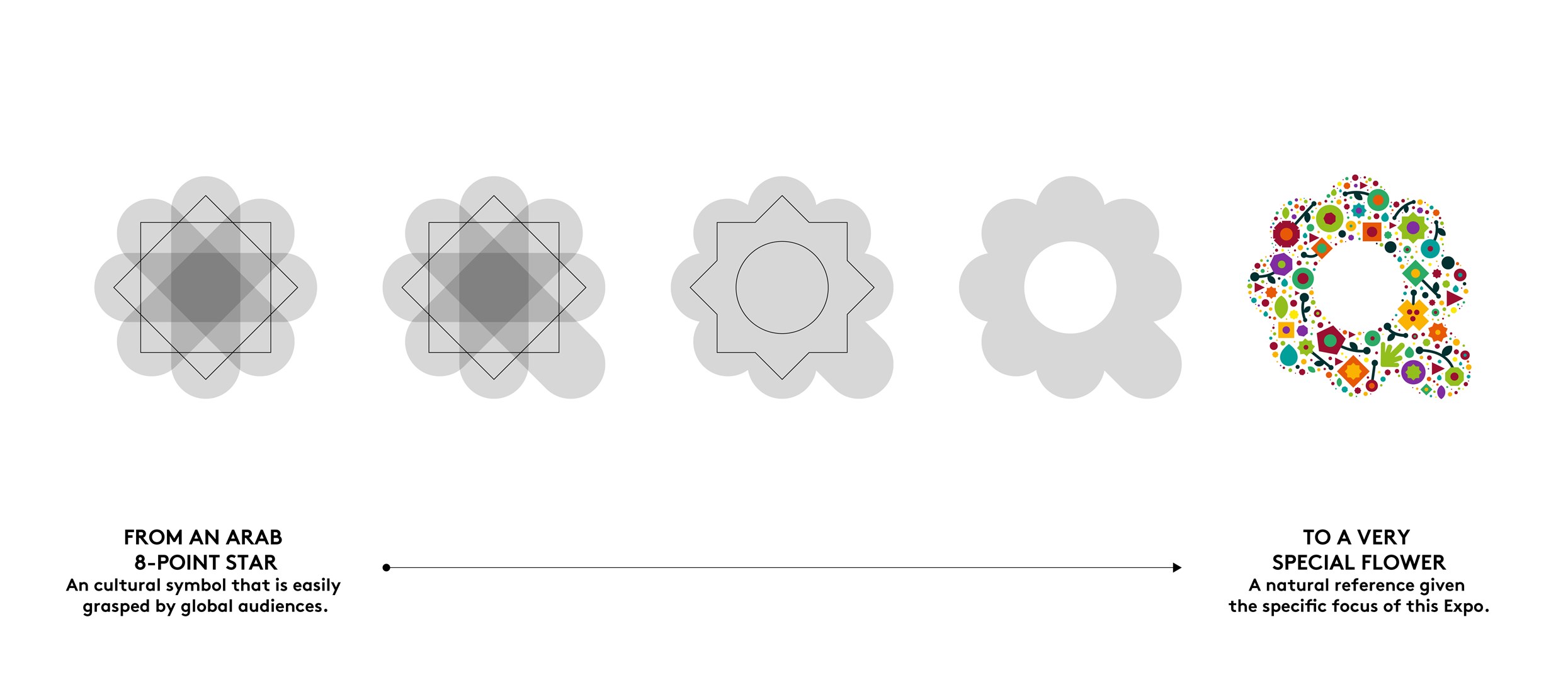
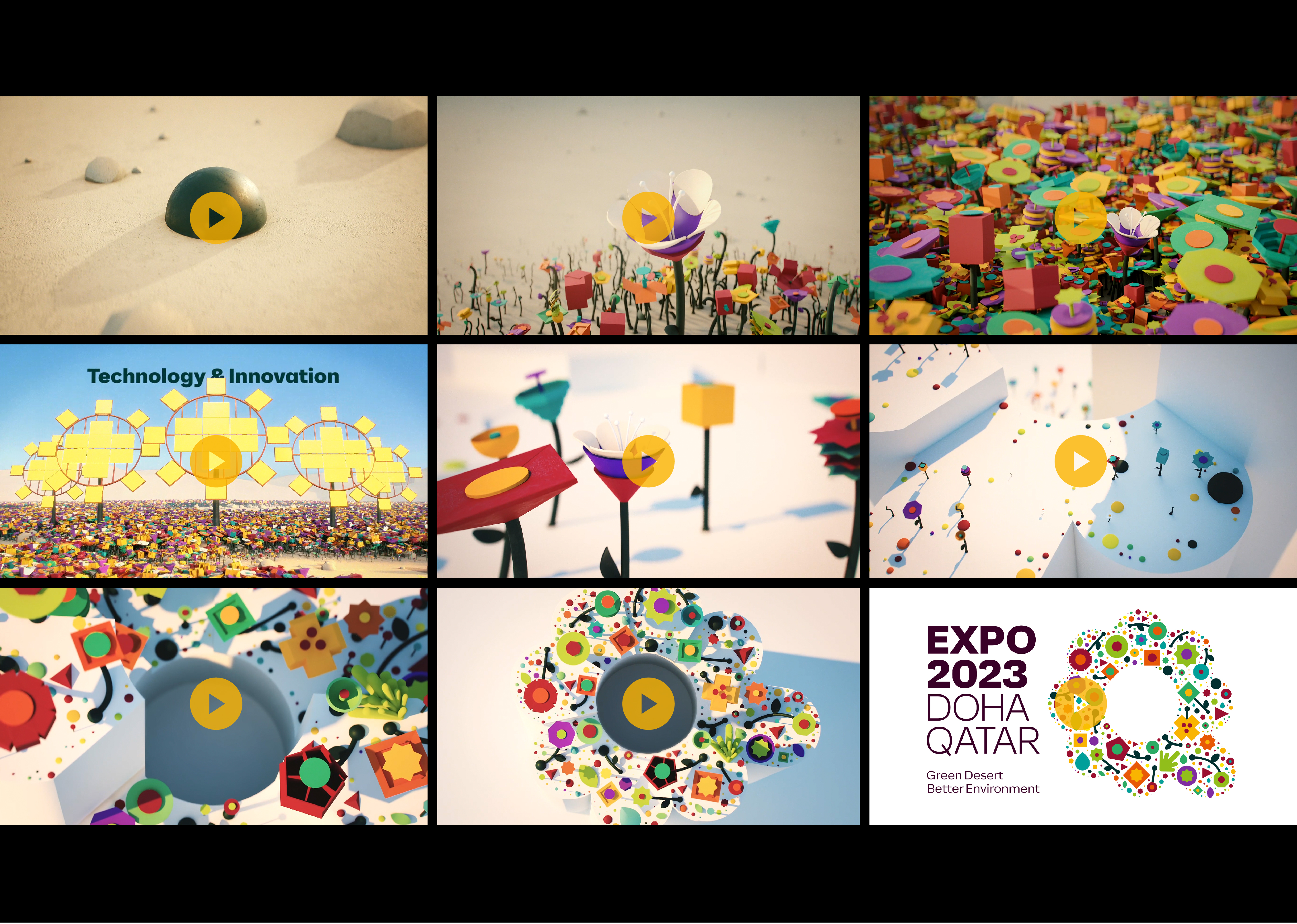
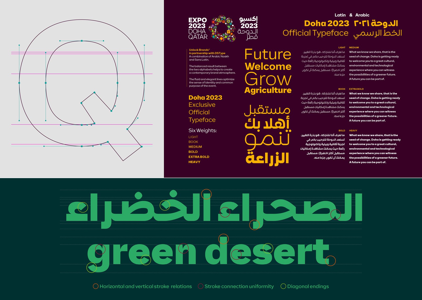
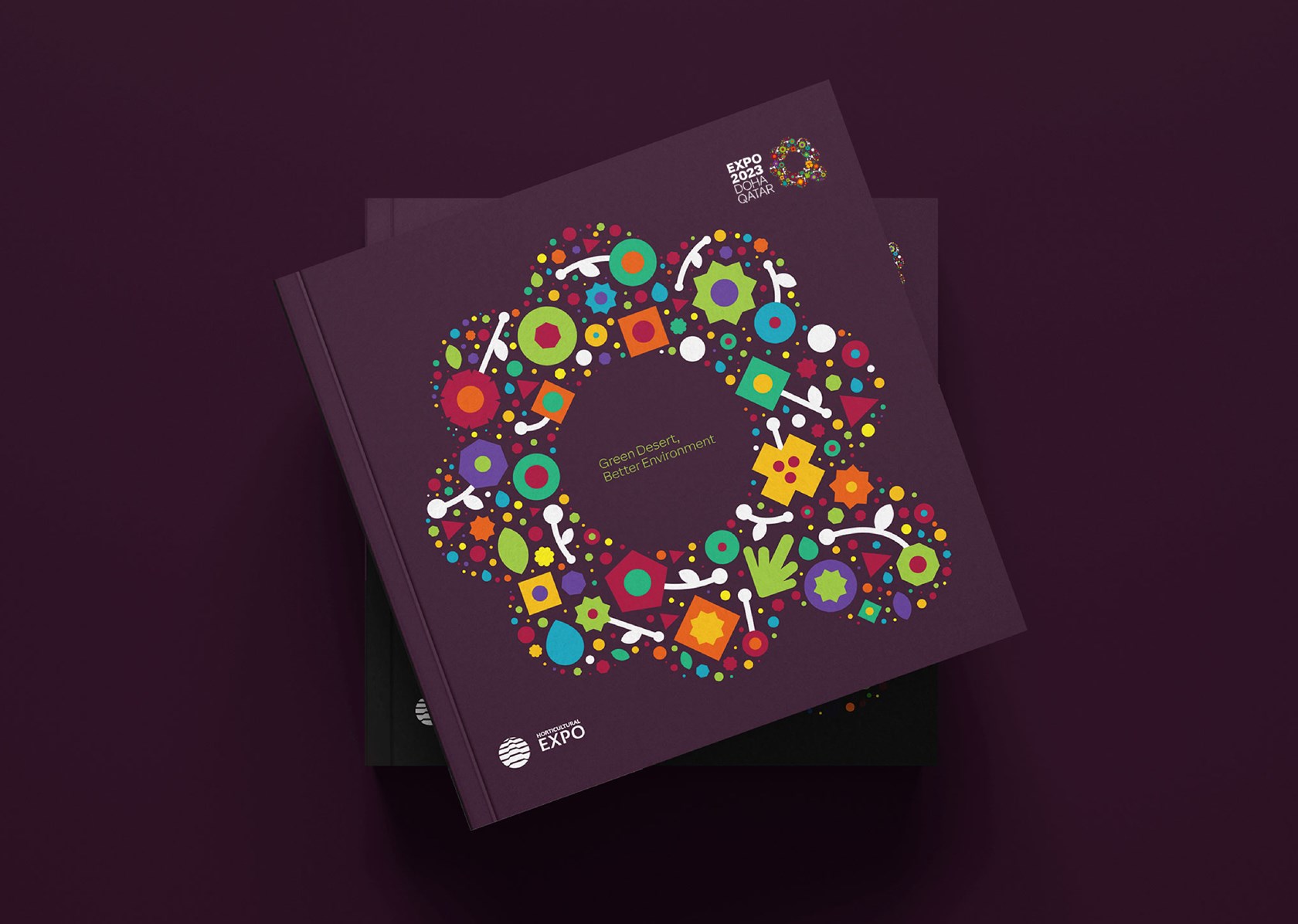
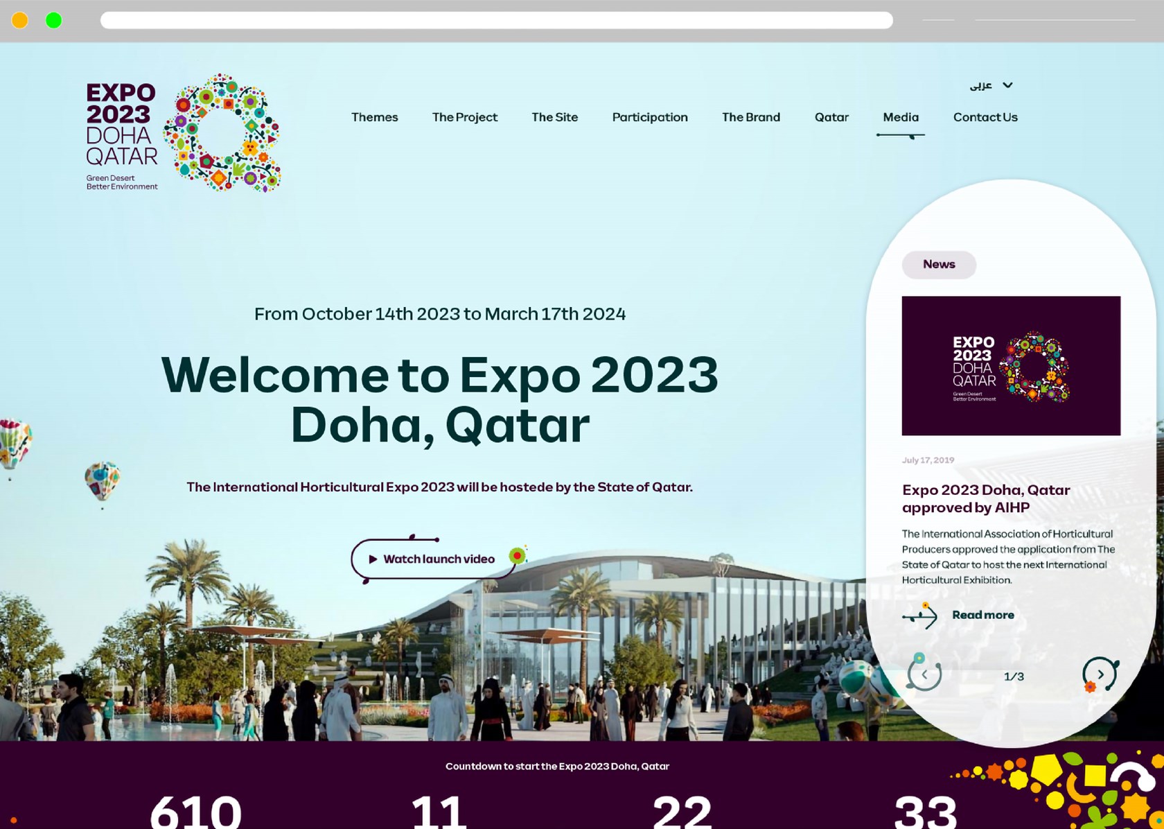
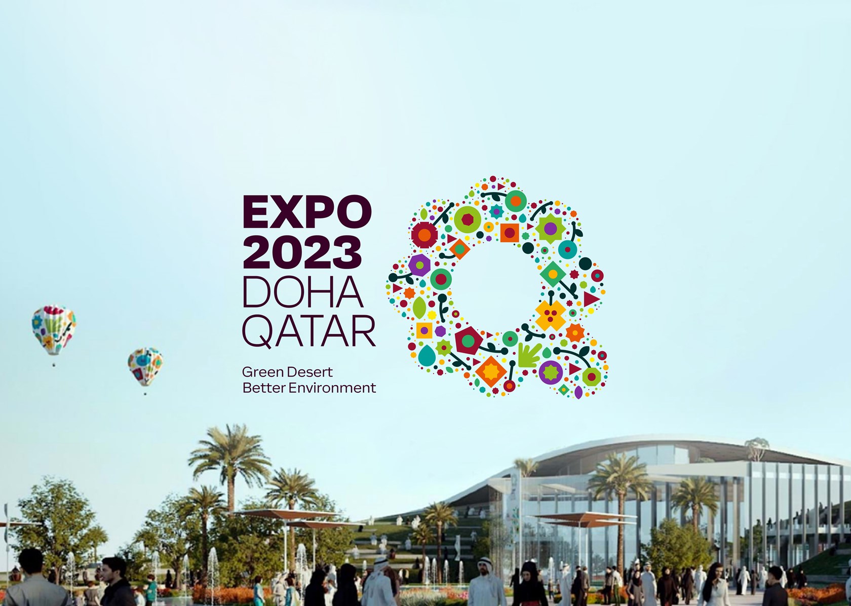
In October of 2023, the city of Doha will host the Expo 2023, an international Horticultural Expo that will gather millions of visitors from all over the world. Its main theme will be “Green Desert, Better Environment”. A global to the best minds and ideas to share innovation and knowledge about Horticulture and its ability to help mitigate desertification.
With a growing international consciousness on global warming and climate change, the hosting of a major Horticultural Expo within an arid climate is extremely relevant and is expected to have a profound impact not just on Qatar but also on the Gulf Region and beyond.