

S—HARE
UNLKBRANDS UNLKBRANDS UNLKBRANDS UNLKBRANDS
Sports and Events

FEI World Championships 2026 —
Win as One.

This is a pro—ject about
  • — Market and Consumer Analysis
  • — Strategic Recommendations
  • — Brand Strategy
  • — Brand Design
  • — Naming and Brand Voice
  • — Brand Communication
  • — Brand Content
Context

One Championship. Two Continents.

The FEI World Championships represent the pinnacle of equestrian sport, bringing together the world's best horse-and-rider combinations across multiple disciplines.

In 2026, the championship enters a new era. For the first time, it will take place across two destinations: Aachen, one of the sport's most iconic venues, and AlUla, a rising global stage for equestrian excellence.

This historic evolution demanded more than a new visual identity. It called for a brand capable of connecting two continents, celebrating the heritage of the sport and creating one unmistakable championship experience.

Following an international pitch, the Fédération Équestre Internationale (FEI) appointed Unlock Brands to develop the brand identity for the FEI World Championships 2026—a global brand designed to unite places, disciplines and people under one shared vision.
Challenge

One Identity. Infinite Connections.

Creating a visual identity was never the real challenge.

The real challenge was creating a single championship capable of living across two continents, two cultures and multiple disciplines, while remaining unmistakably one event.

The brand needed to celebrate the prestige of the FEI World Championships without belonging to a single place. It had to feel timeless enough to honour the sport's heritage, yet contemporary enough to introduce a new chapter in its history. Above all, it needed to express what makes equestrian sport unique: the extraordinary partnership between horse and rider.

To win the most prestigious equestrian competition in the world, you must win as a team. You must win as one.

Miguel Viana, Creative Director of Unlock Brands
Solution

Inspired by FEI’s ambition to unite all national federations and grow equestrian sport, and seeking the perfect balance between the heritage that existing fans love and the modernity that is paramount to attracting new ones, FEI WC26 branding project highlights the value of “perform as one”, paying homage to the unique collaboration spirit between horse and rider.

Symbol

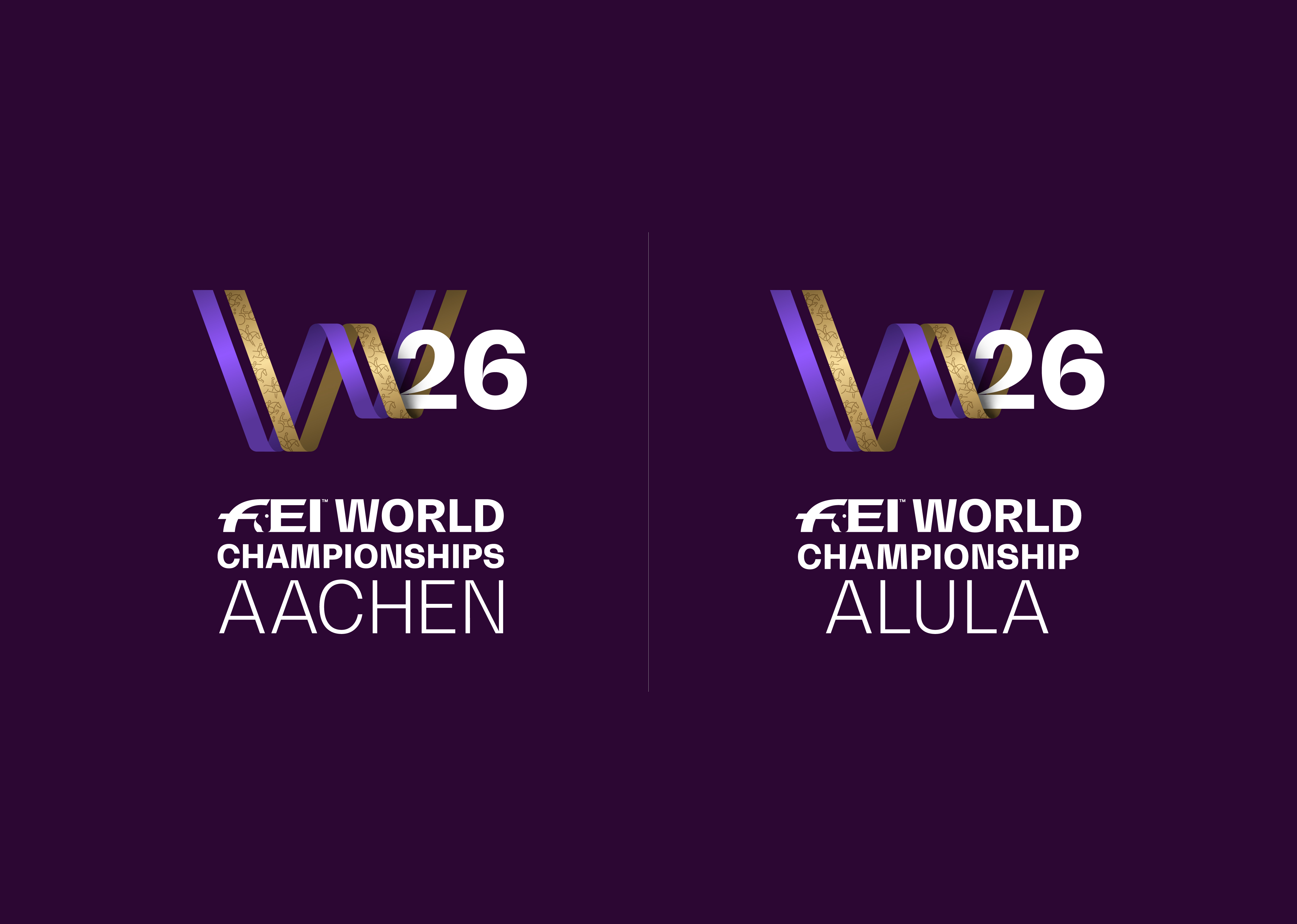
The ‘W’ symbol stands for both “Win” and “World”, showcasing the event’s winning spirit and global scale, and the fact that it is the most ambitious title in FEI’s competitions. Crafted from interlacing ribbons, the elegant design is inspired by the ribbon that holds the winning medals of the champions (embodying unity, triumph), the partnership and shared ambition between horse and rider, and the owing movements of the horses.

Win as One

The symbol is a metaphor for perseverance, collective victory and unity against all odds, which resonates with the tagline Win as One.

Win is the spirit of the competition. As One is the purpose of the Federation. Together, they celebrate the teamwork and perfect harmony between horse and rider.

Colours

The main colours of FEI WC26 are dark violet, lavender and gold, which spread from the logotype to all the key visuals, highlighting the winning spirit, the elegance and the premiumness of the event.

Disciplines

Derived from the elegance and distinctiveness of the logotype, and emphasizing the flowing movements of the horses, the icons clearly represent the different disciplines of the event.

Photographic Style

Dynamic, competitive, elegant, brave, diverse, challenging, intense, epic, vibrant and harmonious meets respect, consciousness, connection, collaboration and care between horse and rider.

SHARE THIS ONE WITH THE WORLD:

Next Sports and Events

Aramco Stadium —
Branding Saudi Arabia’s first World Cup stadium