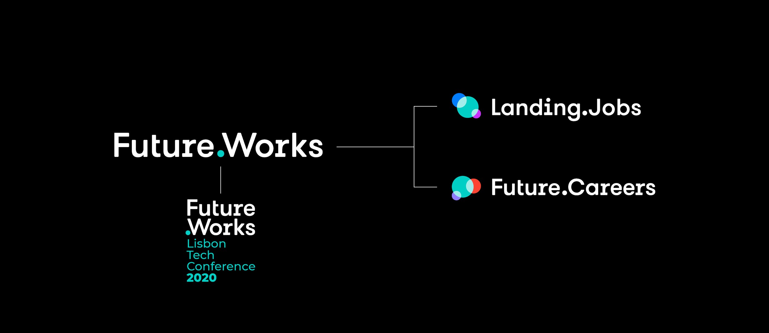
S—HARE
UNLKBRANDS UNLKBRANDS UNLKBRANDS UNLKBRANDS
IT/Digital

Future.Works —
A new brand family to match work with its future

This is a pro—ject about
  • — Market and Consumer Analysis
  • — Strategic Recommendations
  • — Corporate Identity
  • — Brand Design
  • — Brand Architecture
  • — Naming and Brand Voice
  • — Brand Communication
  • — Integrated Projects
  • — Space Branding
Context

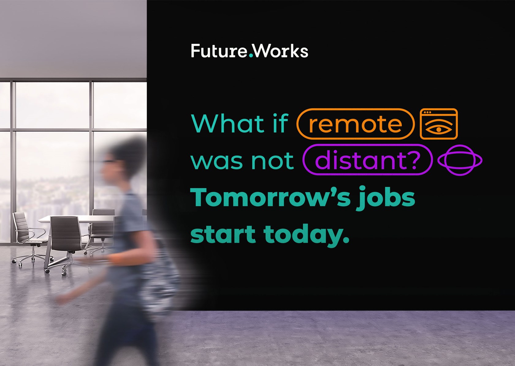
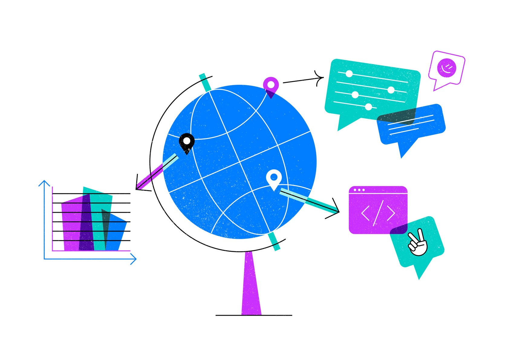
The new normal work ecosystem

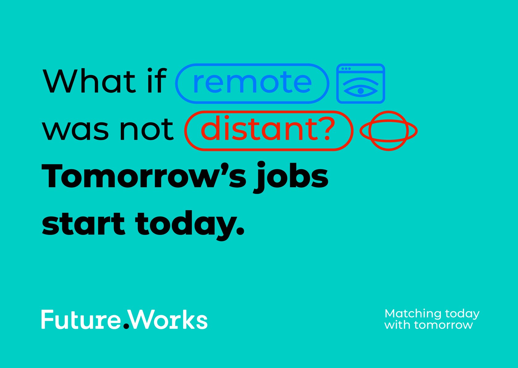
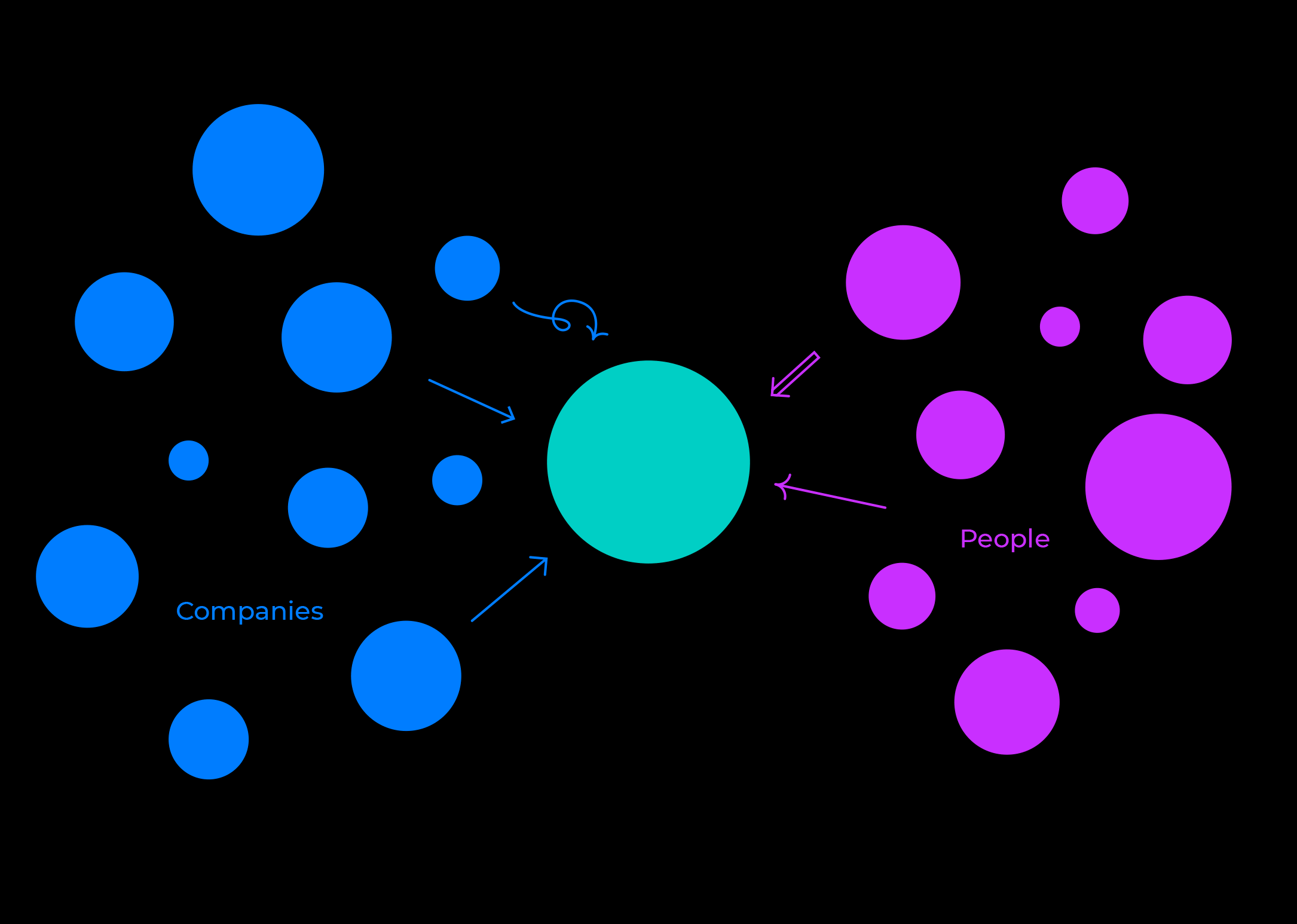
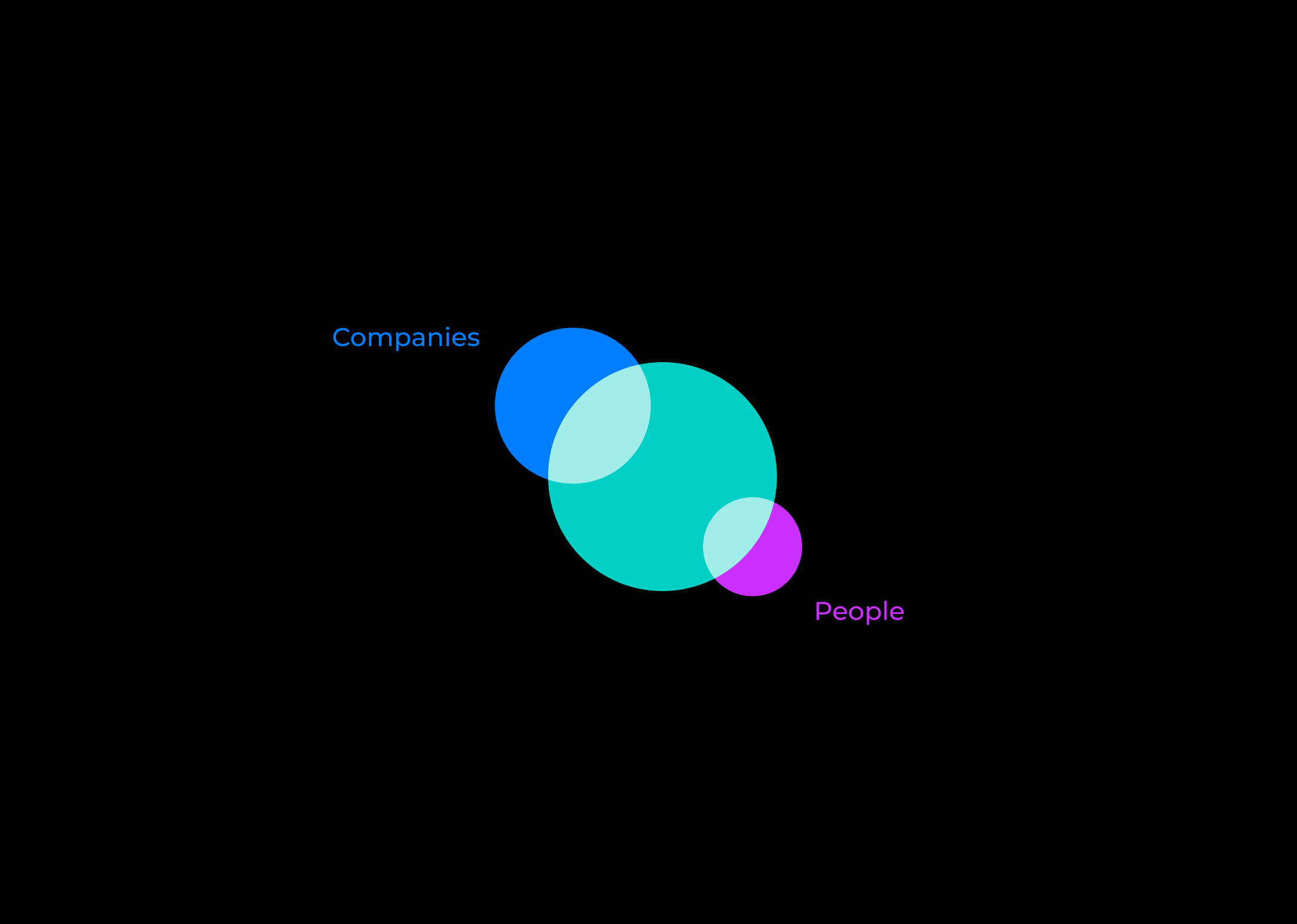
To go to work today is not the same as it was a few years ago. Schedules are more flexible than ever. Workings spaces are multifunctional, multi-task, multi-media, multi-everything. Remote work is becoming a reality for a multitude of people. Companies wanting to be more efficient. Projects’ needs varying from one to another. Sometimes hiring is the option, other times contracting is the best one.

The relationship between companies and workers is not the same anymore. And it is changing by the minute. People want more control over their work/off-work balance. Companies urge to attract talent, namely in the tech areas. Everybody wants to be happy at work.

Challenge

To create a brand to ignite a movement

Landing.Jobs approached us to revisit their product portfolio, specialised in tech recruitment and career management. Landing.Jobs was a successful tech marketplace, providing an exceptional match between companies and talent. There was also the Landing Festival, an event that evolved from a job fair-like event to a community-focused venue where all the people could meet and learn and share.

During the early stages of the work, it became clear that a new brand would have to be developed to create a sense of a unified whole. A brand that would resonate with both companies and talent. A brand of a new approach to work.

Landing.Jobs was an emerging power player in the tech hiring world. Its brand universe would have to evolve, so it could ignite a new chapter in the company's future. And a revolution about the way work was perceived.

José Cerqueira, Head of Content of Unlock Brands
Solution

An umbrella brand to inspire them all.

As we usually do, we started by auditing the company and its core values, learning the product portfolio (existing and future) and its attributes. In-depth interviews with Landing.Jobs team and its clients provided the necessary information. There was also the need to audit the market, mapping the competition, domestic and foreign. Because the market is more global than ever. Tech talent arising everywhere and willing to move to another country if necessary. Or working in remote mode, which means that geography is not an issue anymore.

One of the main conclusions was that a new brand architecture was in order. A new umbrella brand would have to be created to overarch existing sub-brands, such as Landing.Jobs and the Festival. Allowing these sub-brands to focus on their core market. The new umbrella brand would assume the role of the inspirer, the motto-setter.

Hello, Future.Works!

This is the chosen naming for the group. A name inspired by the optimism and the expertise of the people working at Landing.Jobs and all the other tech hiring and career management solutions of the company. A name that tells everybody that new working modes are possible if companies and people anticipate and adapt themselves to flexible and co-operative models. The name also reflects the URL heritage from Landing.Jobs. An ownable domain will always matter.

The UNLOCK moment

Given the matching effect that the company provided, between companies and people, but also between people and an improved version of themselves through qualification and skills’ update, we saw this brand as an engine. Not a search engine, yet a “matching engine”. It provided both sides of the story a complete fulfillment of their needs.

A subtle and powerful visual identity

Future.Works logotype was created to reflect the idea of convergence and gathering of two entities. Talent and companies, present and future. The dot as a common ground between both sides, as well as an immediate indicator of the company’s URL. The main colour is a vibrant green, as a homage to the later Landing.Jobs colour.

A brand with such a will to inspire others would have to present a distinct speech. A bold tone of voice was created. Starting with the brand tagline “Matching Today With Tomorrow,” as a statement of what Future.Works means, as it contributes to aligning people and companies with the upcoming challenges of work.

A new graphic universe was developed, combining pictograms, text boxes, and lively colours. Inspired by the tech imagery and ready to engage its audiences. The elected typography was Montserrat, a Google font designed by Julieta Ulanovsky.

The company’s event was renamed Future.Works Tech Conference, given its role of bringing to life the umbrella brand’s culture and sense of community. This sub-brand was also provided with a new graphic identity, as a natural evolution of the main brand.

A fully refreshed Landing.Jobs brand

Landing.Jobs is Future.Works’ premium brand. It demanded a new visual identity while portraying the belonging to the main ecosystem.

The only thing that was kept was the name. A new symbol was designed, making clear the matching ensured to the tech talent community. Represented by the intersection of the three circles. Landing.Jobs (the green circle) as the platform where the other two parties meet. The colours and the typeface state the alignment with the umbrella brand.

The graphic universe assumed a more proprietary approach. A new illustration style, with overlapping shapes - an added reminder of the matching effect - gave the brand a cool and informal look, quite different from the generic tech-related visuals.

Results

Future.Works and Landing.Jobs are the ambassadors of this new ecosystem. A versatile set of tools prepared to include new products and services from the company, as it keeps innovating and making work and its future work for everyone involved.

SHARE THIS ONE WITH THE WORLD:

Next Retail

IMMOCHAN/CEETRUS + The Edge Group — Partnering to rethinking retail